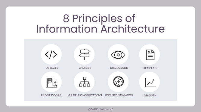
Information Architecture organises content to help users understand, structure and organise information to help us navigate through complex information to make decisions.
Dan Brown, developed eight principles to help designers make the right decisions when creating their strategies.
They are based on the understanding that the focus is on structure of the website and therefore we need to understand the functionality of the site, and what content we have to hand. Once this is known then the website can be optimised using the following principles.
OBJECTS
According to The Principle of Objects, pieces of content have their own attributes, behaviours, and life cycles.
Consider the type of content you wish to create, will it be blog posts, video, or products? Will you need to embed audio or visuals? Where will you be linking from?
Knowing the type of content you will have determines how you will organise and structure it. How long it will last, and if it requires maintenance or not.
CHOICES
The Principle of Choices is about limiting the number of choices for the user to only the most meaningful and relevant. These choices should relate to a particular task, and don’t give the user more than 2 or 3 choices as it gets too confusing and they can run into cognitive overload.
For example, if you have an email opt-in form pop up, there should only be three choices for the user: opt-in, not opt-in / close the popup. This reduces the level of cognitive effort required by the user, improving their experience.
DISCLOSURE
The Principle of Disclosure refers to only disclosing what is necessary for the user to understand what they’ll find next and make a decision.
For example, with your newsletter form, ideally, you’d include a short headline or a sentence asking visitors to opt in, and that’s it. If they do opt in, you might redirect them to a landing page or send a welcome email with more information, but only at that step.
FRONT DOORS
The Principle of Front Doors says that your website has multiple access points, therefore not all visitors will land on your homepage first - they could arrive on a product page, blog post, or landing page, so you’ll need to construct your website accordingly.
Placing navigation aids and important information and elements on different pages, helps visitors know where they are and it helps make the steps they can take next clear, no matter how they got to your website.
MULTIPLE CLASSIFICATION
The Principle of Multiple Classification gives users many ways to browse the content on your site. And it’s important because as we know people prefer different methods for finding information.
Some, for example, may prefer to browse your site by category using sub-navigation menus. Others may prefer to search by keyword using a search bar. Others may scroll down to your footer to find the navigation options, and so on.
It’s not about making things complicated, it’s about giving people options in the way they can navigate your site.
FOCUSED NAVIGATION
The Principle of Focused Navigation means that navigation menus should be consistent across your site and only contain relevant content.
If, for example, you have a primary navigation menu with Product and Services links then each will have its own corresponding submenu. For example, only list products under the products link and services under the services link. Otherwise, you’ll confuse users. Remember to keep it simple.
Remember these principles are to guide your design process - not dictate it.
EXEMPLARS
The Principle of Exemplars means to provide examples (images) of content when it isn’t necessarily clear or intuitive upon reading.
GROWTH
And finally, The Principle of Growth says you should construct your website so it can accommodate your business as it grows. The content you start with will only be a small fraction of the content you will acquire so your site needs to be scalable.
